When Google started testing the new look for its search results pages which ditches the shading behind the ads and replaces it with yellow “ad” icons, contradictory outcries of this sort began popping up,
“Ad click-through rates are going to plummet because the ads are too obvious with those bright icons.”“The ads look like organic listings without the yellow background shading. Nobody will notice those tiny icons.”
Google made the transition to the new look official last week. The other changes that came with the update are the removal of underlines, larger title fonts (and shorter titles) and evenly spaced line height.
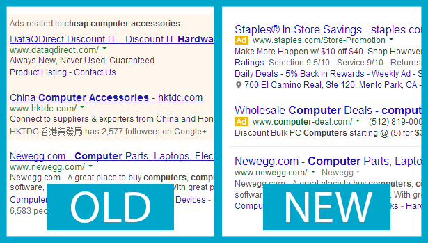
Source: Usertesting.com
The team at Usertesting.com set up a usability study to find out whether users respond differently to the new design, which Google says was aimed at improving legibility and freshening up the page with a cleaner look
The sample size is small at just 50 participants, but the results are still interesting.
First, users were shown each design version separately and rated how easy or difficult it was to tell the paid links from the unpaid links. The scores were tied, yes absolutely tied. The icon-minus-shading made zero difference to the users that were polled.
Old Google Score: B (87.2 percent ), Avg. Score: 4.36 (out of 5)
New Google Score: B (87.2 percent), Avg. Score: 4.36 (out of 5)
The scores were also tied when users were asked to look at the two versions individually and rate how easy or hard it was to read the links.
It was actually the change in line spacing that generated a higher approval rating for the new version. The old version received a score of 87.6 percent while the new version managed a 90.8 percent.
When users were shown the two versions side-by-side, however, and asked which version helped them determine which links were paid and which were unpaid, the new version won out. Just over half of respondents (26) said the new version was more effective, while only 12 found the old format more effective. The other 12 had no preference.
Overall, the new version was preferred by 33 of the participants, who called it “clean”, “fresh” and “uncluttered”. So, from a users’ perspective, it would seem Google set out what it aimed to accomplish. However, advertisers and SEOs will continue to examine the business impact these changes make for quite some time.
Great post for Digital Marketing . keep it up.
ReplyDeleteNice post for this It was such a helpful information for us.For more information.information
ReplyDelete.
I hope you'll share some more information regarding Digital Marketing . I appreciate your work.thank you for sharing such important information. It'll be very useful for us in the future. Good keep it up and keep writing. See More About..
ReplyDeleteNice post for this It was such a helpful information for us. For more information about digital marketing
ReplyDeleteYou will like it to enjoy our new app Fasting Apk : which you could download and enjoy loose.
ReplyDeleteThanks for Your Great post. Users Really Think Of The New Google Design more information
ReplyDelete